

“We don’t want to do a general renovation, just change the facilities and replace some deteriorated coverings… and little else.” To follow this directive, we decided to change just a few elements of this apartment, which, although specific, ended up completely transforming its interiors and general layout.
The building was built in the late 1970s within the context of the first law on “Viviendas de Protección Oficial”, the well-known Spanish VPO, with which the State intended to reduce housing shortage. Guided by quantitative objectives, the program resulted in the construction of thousands of units, which were, however, of poor quality, with generic layouts and materials that were not always durable.
The three children of the owners moved to other cities, which led us to rethink the general layout. The couple wanted to preserve their children’s bedrooms so they would have a place to stay when visiting. However, as the owners reported that their children’s visits rarely happened simultaneously, we chose to propose just one guest bedroom, while the other bedrooms were integrated into a new living area, increasing the range of the apartment’s daily use.
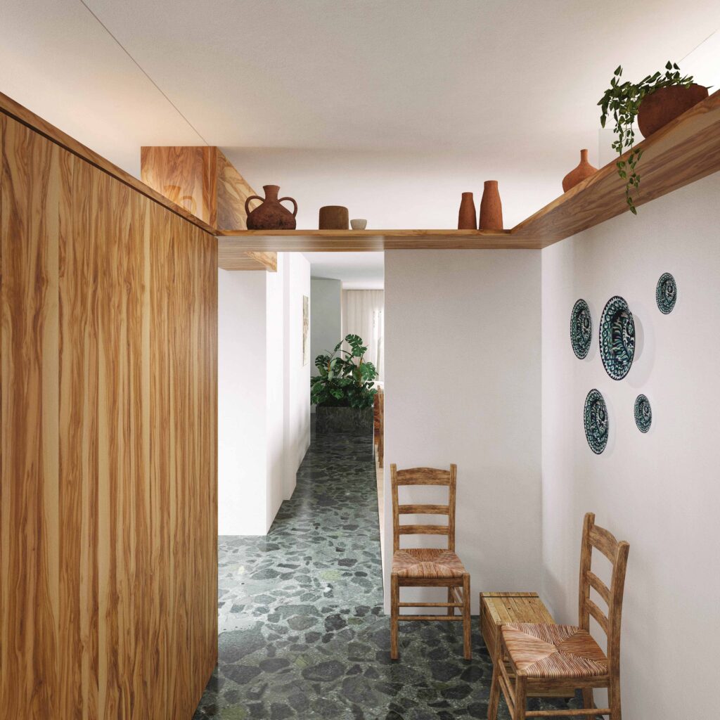
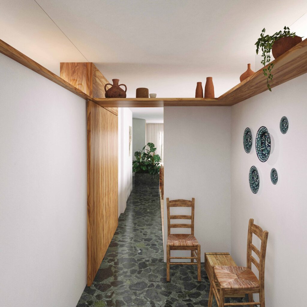
This new living area takes on a peculiar shape that is the result of several decisions. Firstly, the decision to keep some rooms which, we realized, were full of emotional memories and ingrained habits, such as the master bedroom, in which the couple spent half of their lives, or the two rooms with balconies, which the couple used in the traditional way as “living room” and “intimate room” respectively. Secondly, the decision to maintain the placement of the bathrooms, whose relocation would make the renovation more complex and expensive. Finally, the decision to preserve materials that were in excellent condition, such as the original green and red terrazzo floors, as well as some white marble thresholds and baseboards, thus making it necessary to maintain the original position of many walls. This, however, did not prevented us from making openings in the upper part of these walls, connecting spaces in different ways, such as in the entrance hall or in the two rooms in the back.
The new living area was spread across the entire space of the apartment, without the conventional division of day and night uses in the plan, and without a corridor, allowing the area of the apartment to be used from one end to the other by this new living area, without making this area a single large space. In its place, the new layout creates a sequence of juxtaposed domestic-scale spaces which allow for multiple, simultaneous or separate uses, with partitions that enable the spaces to be integrated or intimate, as desired.
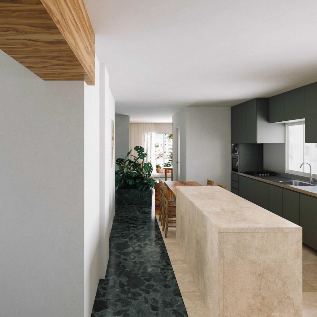
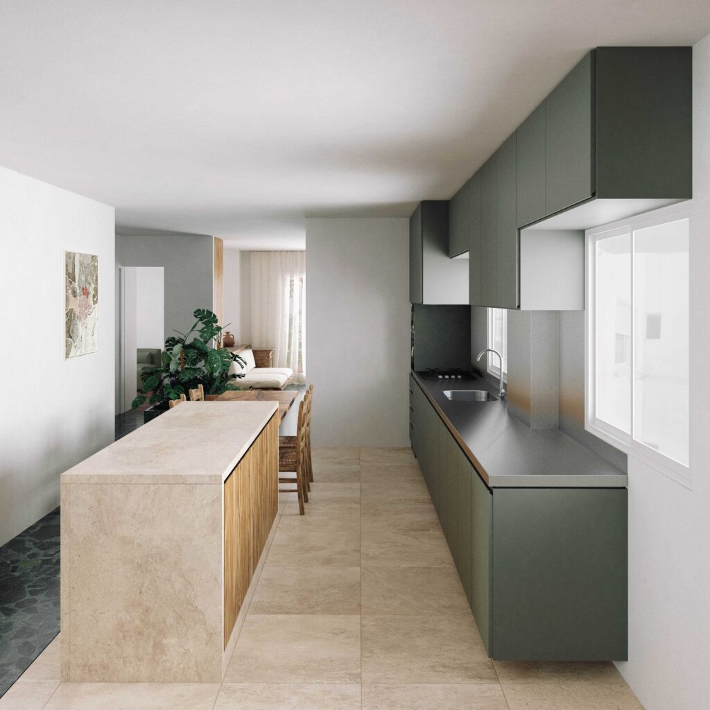
The central part of this living area is the kitchen – which already had the most important role in the daily life of the house – but now more spacious and connected with the two living rooms. The kitchen will remain as a place to cook for hours, eat meals and gather family and close guests. The kitchen now also takes advantage, along with the living area, of the privileged situation of the apartment, which occupies a corner of the building. Thus, the kitchen is in contact with the two balconies on the two façades, and with the building’s airshaft, resulting in a space with abundant lighting, cross ventilation, and various views.
As in many historic houses, the apartment’s circulation was organized in an axis, with two lobbies that function as atriums – one upon entering the apartment, which gives access to the kitchen and the first living room, and another at the back, around a planter, for the most intimate accesses: to the back room, the bedrooms and the guest bathroom.
The deteriorated coverings in the bathrooms and kitchen, which were made of low-quality industrial ceramics, were replaced by traditional materials such as marble or hydraulic tiles, placed side by side with the preserved existing materials, sometimes in dialogue, sometimes in contrast. Some pine wood elements complement the main materials, as well as the kitchen table, which takes on a special role: designed in solid olive wood – as were some chairs that were part of the apartment’s existing furniture – the table echoes the memories of the family’s rural origins and their connection to olive farming.
The hallway, a symbol of urban life in apartments, gave way to a living space without excessive definition of uses, as in many traditional rural houses. The large pantry allows for the storage of large quantities of non-perishable food and homemade preserves that the couple brings from their small hometown, a practice very much detached from the immediate availability of supermarket products which characterizes urban life. A rural apartment in the capital, perhaps? In any case, it is a house adapted to the way of living of its inhabitants, and not the other way around, as it often seems to happen.
Design:
Fernando Delgado, Isabela Canêdo, Renan VargasTeam:
Carol RochaLocation:
Calle Alameda de Capuchinos, Málaga, SpainProject start:
2022Floor area:
151m²Status:
Under constructionConstructor:
Construcciones Lanzas y RodriguezCarpentry:
Peña Vera (general), Yevea (olive wood), Evacocina (kitchen)Marble:
Mármoles Iznajar (general), Evacocina (kitchen)

